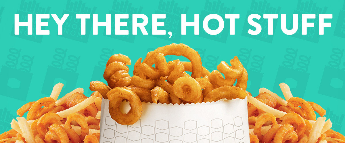

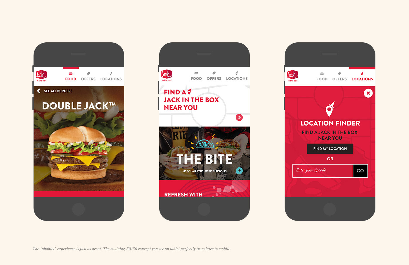
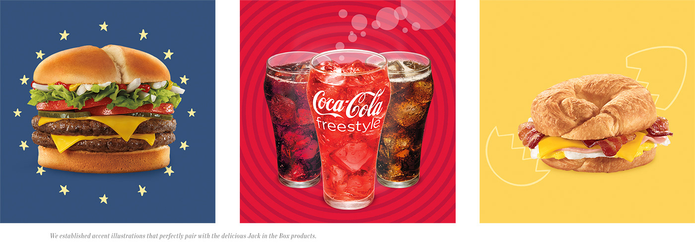

Nearly five years into our relationship with Jack in the Box—and three years after we tackled the re-design of Jack’s digital home—it was time to give their website a comprehensive renovation. With a focus on adaptability and responsiveness, the new site is a blend of a sharp digital aesthetic and strong content infrastructure. The food is big, beautiful and layered on top of itself. Locations are easy to find. Deals and special offers are everywhere. And it’s all built in a modular, adaptive system that varies from two columns (left fixed, right scrolling) to one column (super scroll!) based on screen size and device. It’s a substantial upgrade matched only by the continually craveable Jack in the Box Mini Churros. Seriously. If you haven’t tried them, you’re missing out. The entire site is essentially no deeper than one page and easy to access new products and campaigns seamlessly.